
A new way to store and organize the digital items you share
Role
UX Design, Branding
Tools
Figma, InVision, Draw.io

UX Design, Branding
Figma, InVision, Draw.io


Current cloud storage providers do not offer the ability to save, share, and organize the content you discover online. Revisiting an item that you shared or has been shared with you can require endless scrolling through a thread or relying on your memory of where it came from.
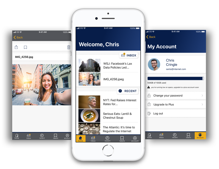
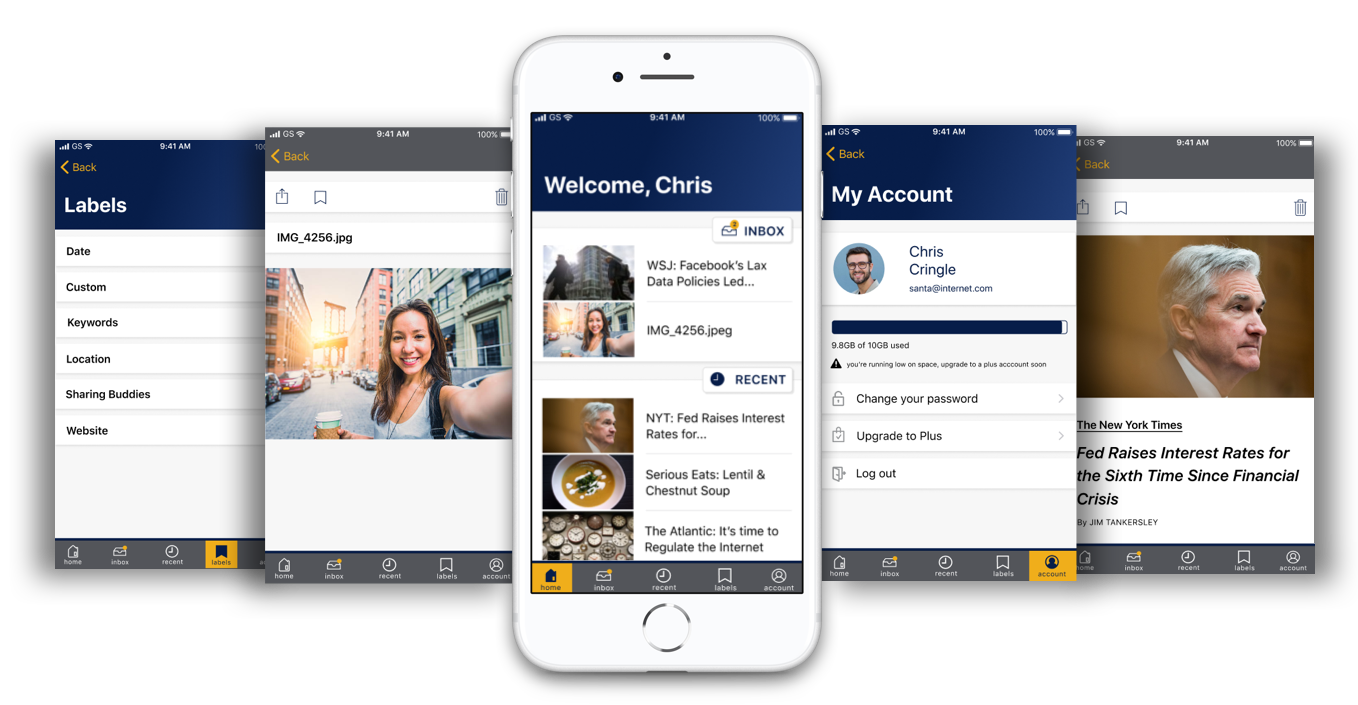
Cache is an iOS mobile application that provides a one-stop-shop to store and retrieve the content shared between you and small groups of family and friends. Send articles or funny videos straight from the mobile web browser and Cache will automatically store and organize the content for you.
I prepared a SWOT Analysis of three competitors. Dropbox and Google Drive are two of the biggest names in cloud storage service and Pinterest catalogues and collects items found on the web.
I saw an opportunity for a new type of product: an application that organizes content by tags or labels as opposed to folders. Removing the folder system that drives competitor's applications allows users to retrieve content with greater ease. Tags will automatically be created from the metadata of the file, such as title, location, author, website, and date.
I needed to figure out if people would even use an application like Cache. The survey results showed that 50% of survey takers are sharing discovered content with close friends and family at least once a week. They're also sharing photos taken with their smartphone. Survey results and interviews also revealed a desire for easy organization and revisiting.

respondents who save content they discover online

respondents who don't organize their bookmarks because it is too time consuming
I created two personas, one centered on photos and the other on articles. Their main focus is the content itself, which needs to be easily stored and retrieved.

“Reading and learning is part of my everyday life. I'm looking for a quick and easy way to save and share what I find.”

“Sending photos is how my family and I share our life experiences with each other since we don't live near one another.”
I developed user stories for new, returning, and all users. I took all of the high level stories and a few medium levels to round out a Minimum Viable Product.
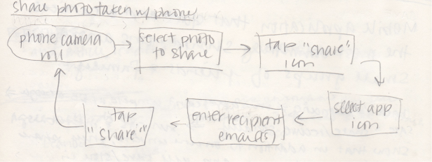
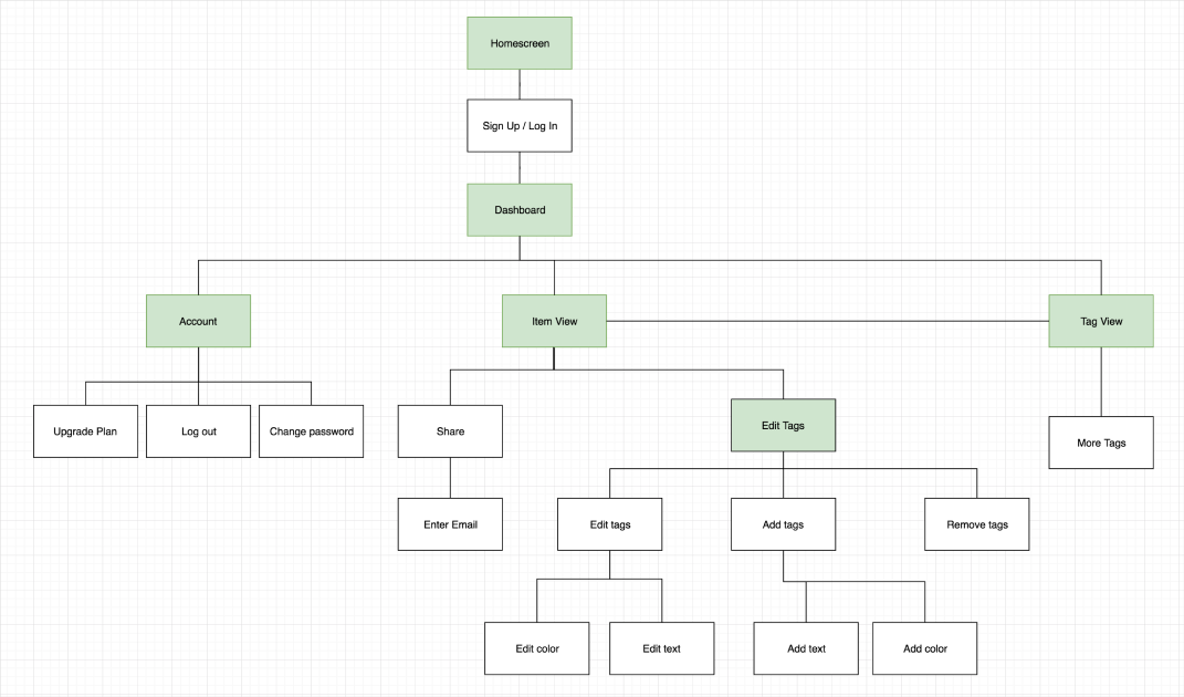
I created user flows in Draw.io based on those MVP user stories to figure out how users will interact with the application and ensure tasks were not getting overly complicated.
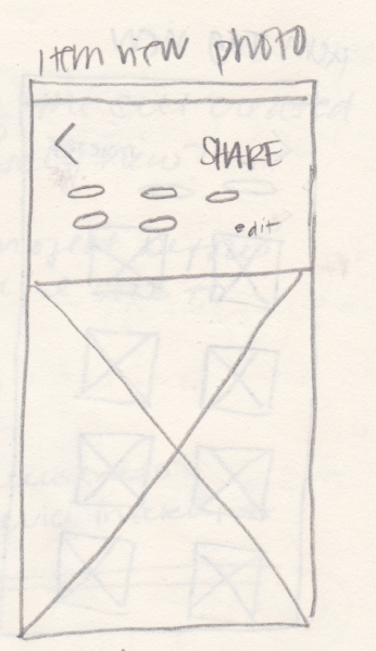
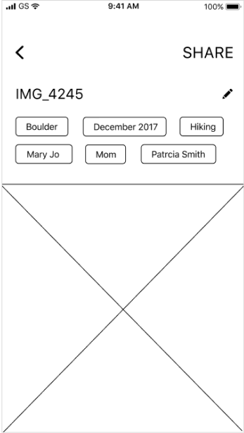
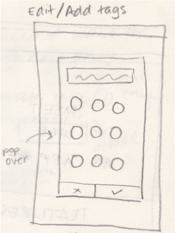
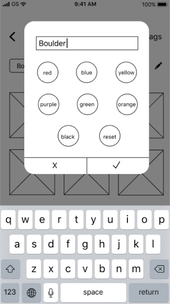
I sketched out basic screen layouts, then cleaned them up in Figma, and created a low fidelity clickable prototype in InVision for testing. There were a few things to learn from this first round of testing such as the lack of a navigation bar and that the words “tag” and “share” made users think of social media, which meant the concept was not clear. I also learned to use Apple's Human Interface Guidelines more, not just in the visual design but the function as well. It also showed me that I needed to offer an opportunity for users to experience the application before signing up, so I created an introduction that used screen grabs of the mockups to show users what to expect.
sketch of the photo item view
wireframe of the photo item view
sketch of editing/addding tags
wireframe of editing a tag color
sketch of two tags's search results

wireframe of two tag's search results
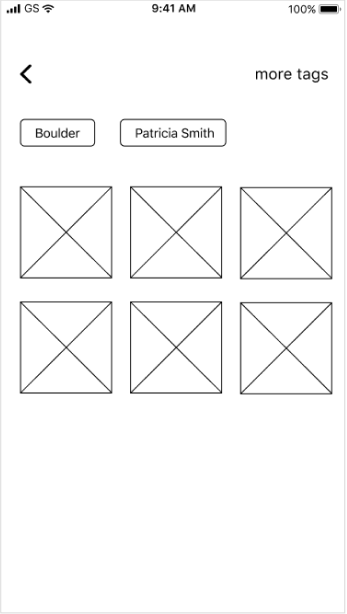 view lo fi prototype
This is a utility application where I wanted to provide a non-distracting environment for users to find what they are looking for. My goal was to create something clean and simple. While the brand has its own typography, I used Apple's SF Pro Text for the application itself.
The logo is straightforward and non-flourished. The shape around the first “C” evokes the commonly used save icon because the application does just that, saves content.
I felt that providing a comfortable and relaxed feel would help to alleviate existing negative feelings towards organizing and searching in a digital platform. I chose a deep calming blue and cool gray neutrals for the main brand colors and a shade of yellow with touch of orange in it as the accent color to add a dose of cheer.
logos
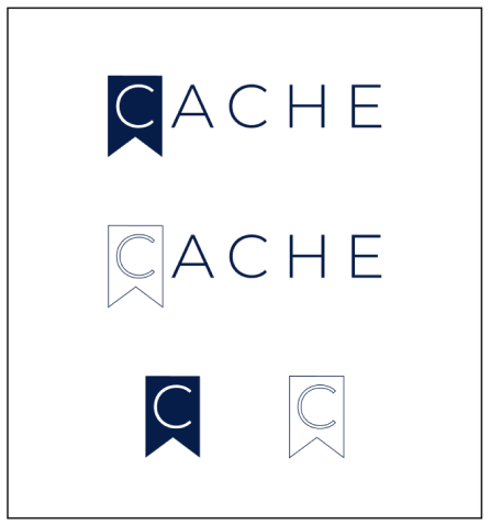
colors

icons
buttons
I took the wireframes and content I created for the marketing website and added visual design. I also took the feedback from testing the low fidelity prototype to update the screens and added visual design elements. I then created a clickable prototype with these high fidelity mockups to test again, which led to additional updates.
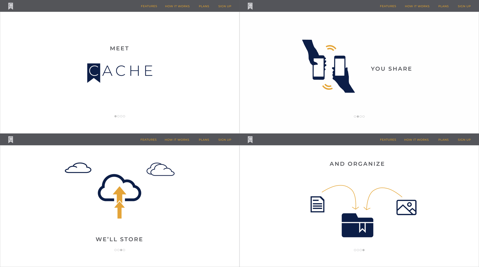
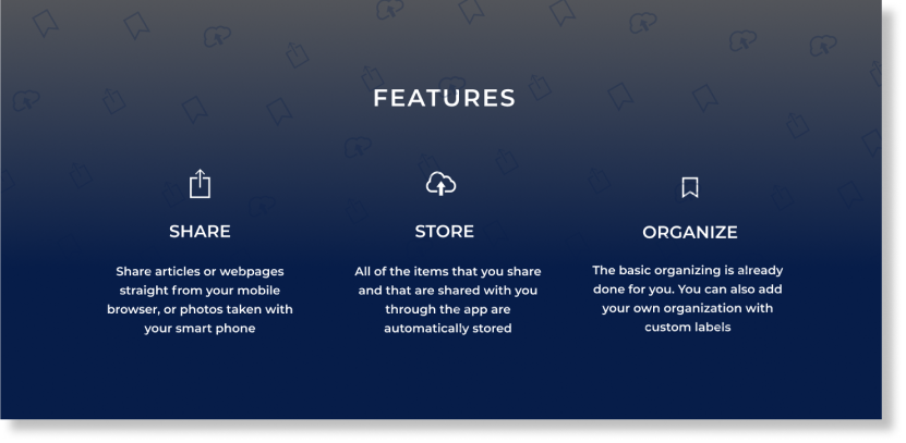
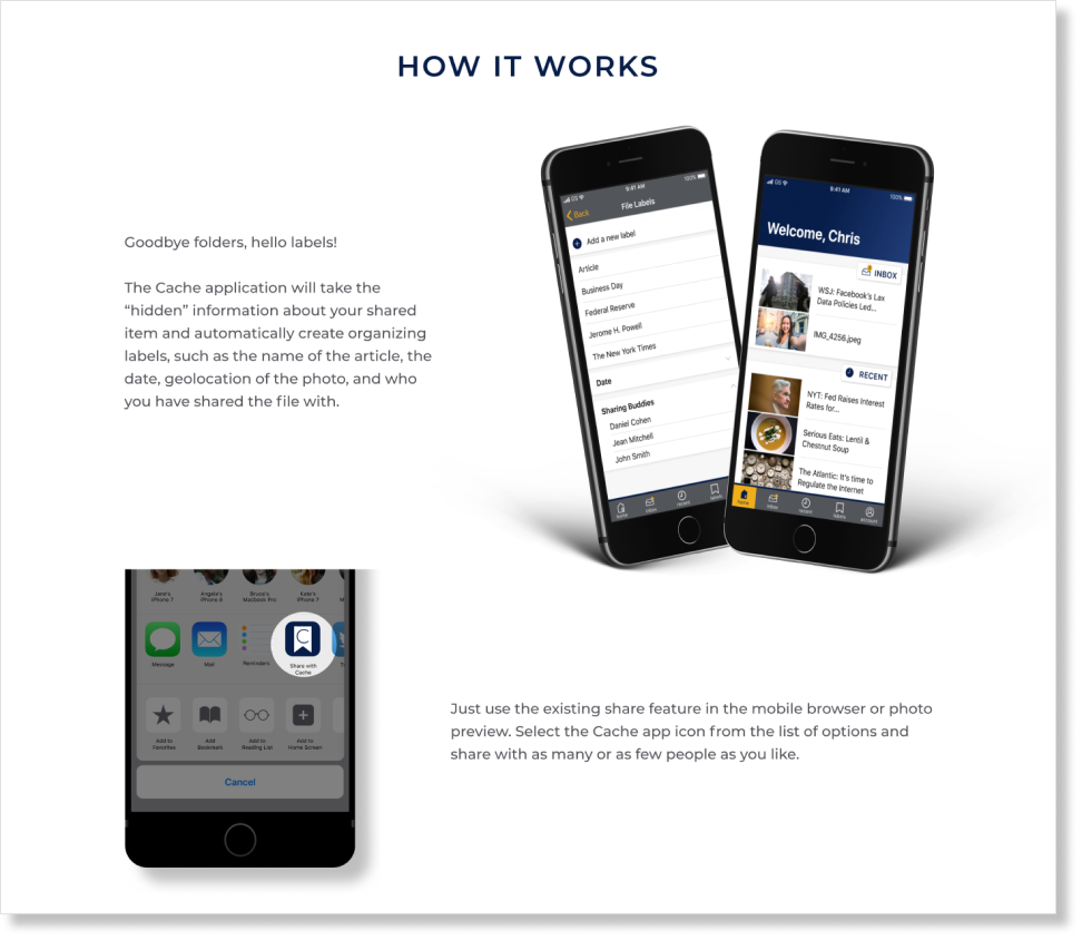
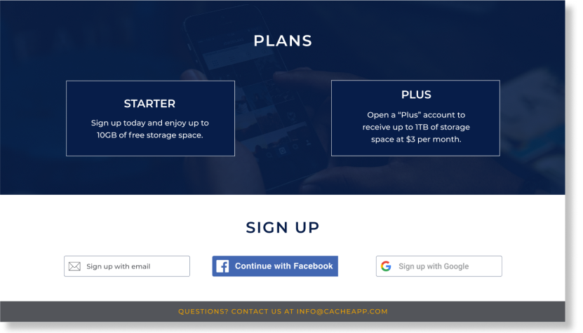
When testing the high fidelity mockups, testers only quickly glanced at the introduction screens and still didn't fully understand the concept of the application. I added more visuals and one more screen to the introduction in order to catch the user's attention. Additionally, an empty state did not exist for the application and testers were confused when they signed up for an account then entered into a returning user's experience.
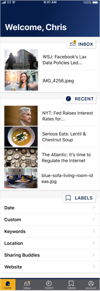
view prototypeI was afraid of creating a distracting visual design in my first attempt, which led to a bland look. In the last iteration I added color to the top to feel less sterile. I also personalized the header to bring out the friendly aspect of the brand.
Further updates were made to the navigation bar. I added descriptions to the icons because I found users did not understand the icons alone during testing. In addition, I highlighted the icon in the navigation bar to let users know which screen they are on. In the first iteration the icon was filled to let users know the current screen; however, testing showed that this approach did not translate that message at all.
first iteration of the dashboard
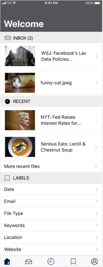
last iteration of the dashboard
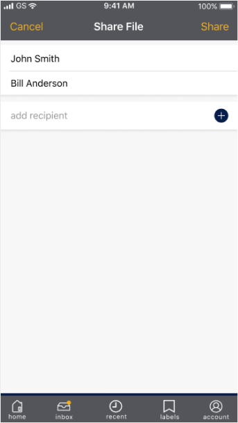
I modeled the first iteration of the Share feature to look like users were sending an email. I wanted this to correspond to current methods of sending and sharing content. In testing users thought Cache integrated with the email application on their phone, as opposed to sending content within the Cache application itself. I updated the Share screen to be in line with the rest of the in-app experiences and to reduce confusion.
first iteration of the share screen
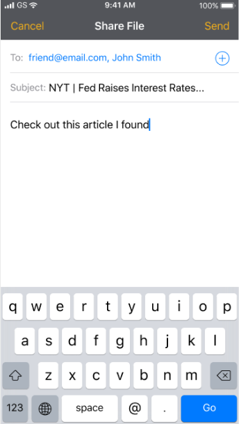
last iteration of the share screen
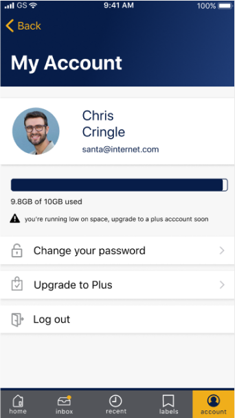
The first iteration of My Account did not include a user photo because I wanted to keep everything simple. I later decided that if a user signed up using Facebook or Google, their full name and profile picture will be imported to create a more personalized experience. I also added icons to the different actions to help users with visual recognition and to bring out more of the Cache brand character. Additonally, I included a warning that storage space was running low and a suggestion to upgrade for more storage. This serves as a secondary signal to users that they will not be able to save content in the near future.
first iteration of the account screen
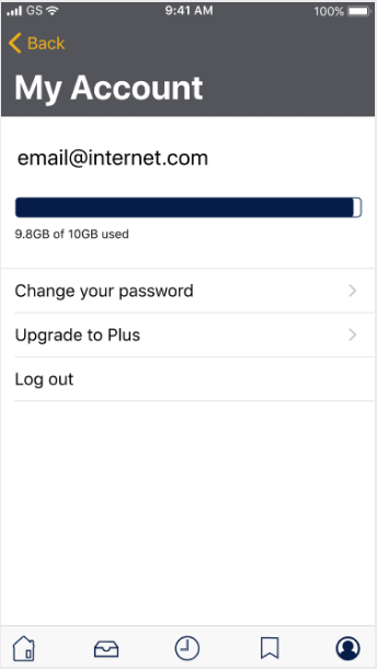
last iteration of the account screen
The first key lesson was the importance of telling your brand story.
Give the users something to connect with, otherwise you can't expect them to give you their time and personal information.
The second was the value in testing user stories.
I was overly concerned that users could complete a task that I didn't test if the feature was necessary at all.
In the last iteration, I ended up removing two features.
The third was how to be mindful of using familiar terms and screens.
My use of “tags,” “email,” and “share” confused testers because they were not being used in the same exact way in this application as in others.
In the end, users had a harder time understanding the concept of the application than I expected, but I was relieved that they were still able to navigate through the application and complete most tasks without problems. Since there were still big changes made to the design, I would like to have tested one more time to evaluate the updates before moving forward, as well as test the marketing site.